INFORMATION ARCHITECTURE | Autosyst Consulting
+2348036078968, +2348025451516 [email protected]

Information Architecture

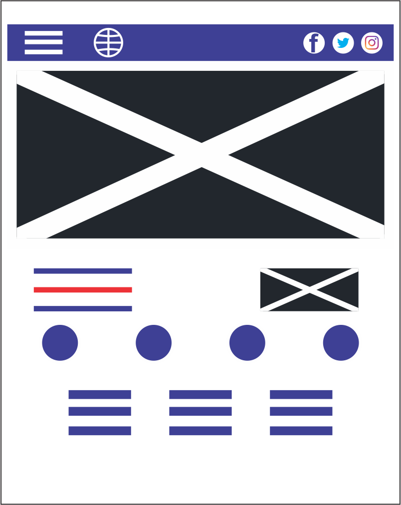
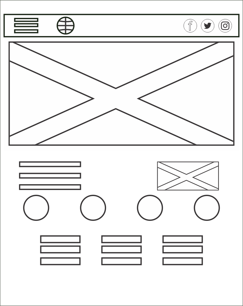
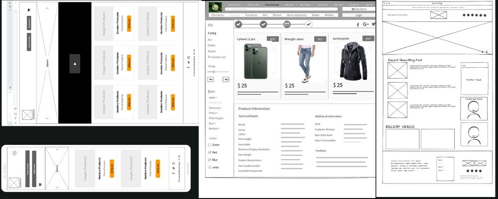
Every high-performance website starts with a wireframe. Wireframes are your first chance to visualize your website. Our team of experts provides you with details of your websites. We give you a visual representation of the site’s overall layout
Autosyst Consulting

Our Development Process 

We design your website from the scratch using wireframes that represent your imagination
and create a friendly user experience for your clients with unique navigation and
relevant content.

We build custom website with a unique user experience 

Defining Your User Interface

We define your visitors’ objectives when coming to your website. Highlighting the step-by-step process of how your user would navigate your website and find the information they are looking for will provide insights into designing a user friendly website. A user interface that reflects your target audience will give you an understanding of everything you need to know about your visitors, from how to map your wireframes to where to place content for the people it is meant to serve.

Designing a Wireframe for Your Digital Content

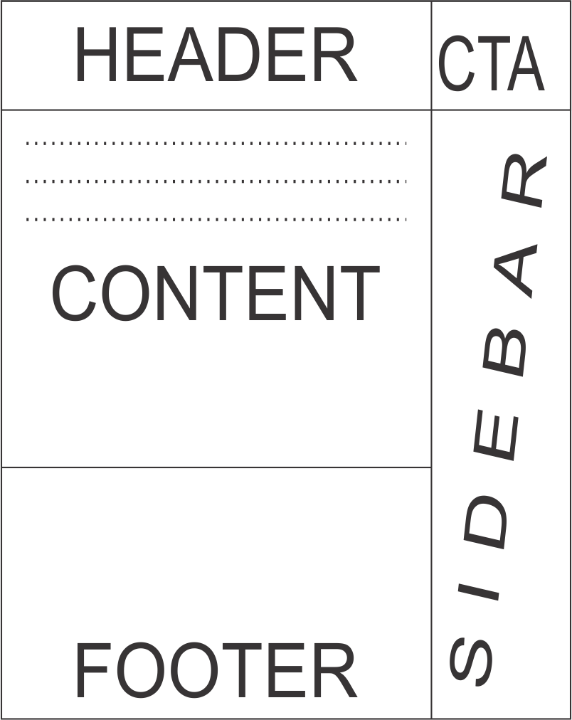
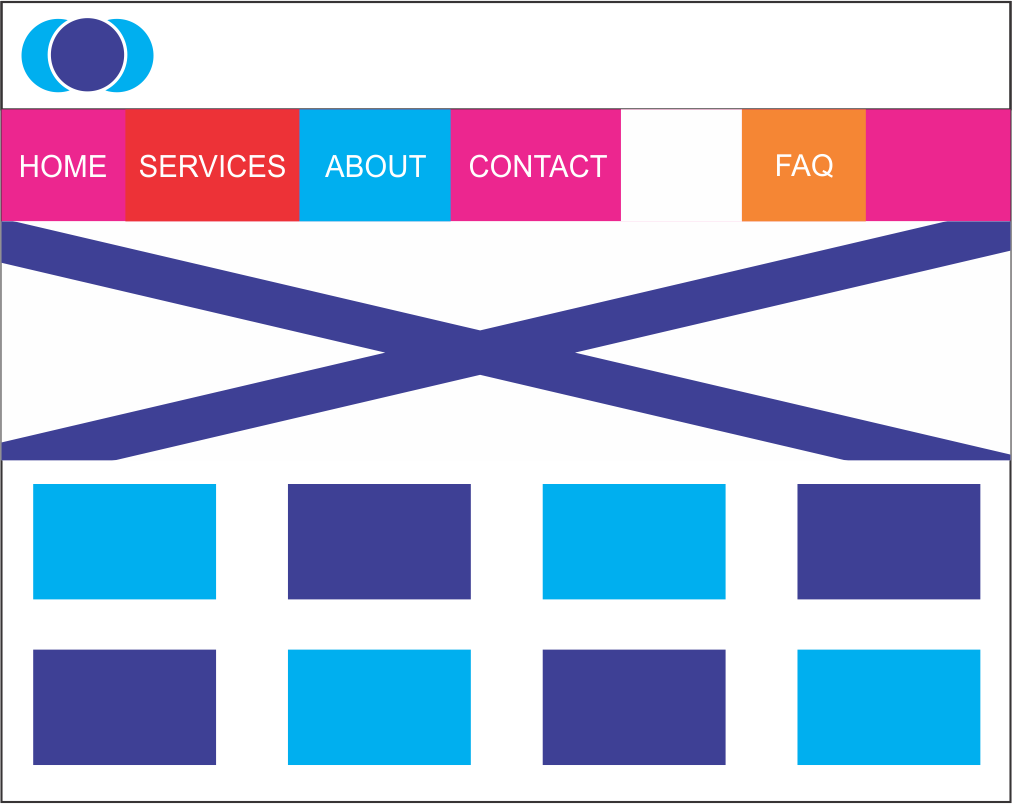
Wireframes are your first chance to visualize your website. They give you a visual representation of the the site’s layout of your web pages and also determining the placement of individual elements of a page. 

Designing Friendly Navigation Experience for Your Visitors

With an organized website that has consistent and friendly navigation, visitors will become comfortable and familiar with exploring your online business, which is the first step towards gaining their trust, bringing them back to the site, and make them stay on your site without looking anywhere else.

Organizing Your Content Appropriately

The location of content on your pages and website will determine whether visitors actually see it, and if they are likely to interact with it. Putting your most important content above the fold and on the left side of your page is an innate viewer usability factor that immediately grabs the attention of your visitors, ensuring they don’t lose interest in your website because they couldn’t find your content.


Seeking a Digital Solution? 

Pin It on Pinterest